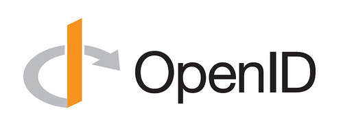
Third Go Around
I’ve been displeased with certain aspects of the OpenID logo as it stands for a while. The orange is too reddish, the perspective of the o/d curve and arrowhead have always been wrong, and the type is too tightly kerned, light and, well, orange.
Additionally, it’s always worked poorly at small sizes and completely fails to work in monochrome. One school of thought says that the shape is the most important aspect of a logo. The colors, if there are any, should be secondary. The first two iterations used an outlined version of the o/d curve. This time I thought a gap would work better. Turns out it solved both problems at once, as well as strengthened the the I character that anchors the glyph.

Changes
- Added gap around ascender for small and single-color reproduction.
- Gap increases in size when shape is scaled down.
- Stem: Increased ascender height; reduced isometric perspective.
- Arrow: Rotated, reshaped, non-square.
- Type: Increased letter-spacing; Helvetica Neue Regular (vs Light).
- Color: Darker gray for curve/arrow; Pantone DS 32-1 C for stem; black for type.
Visual comparison of v2 and v3 (PDF).